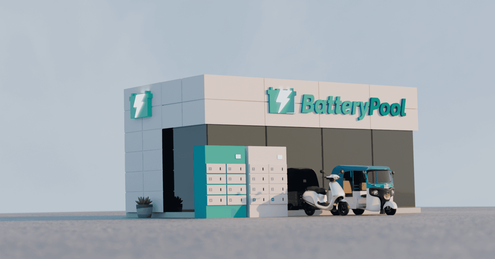
How we designed a complex dashboard for a Battery-as-a-service startup which helped it's users swap fully charged battery with an discharged one to keep their EV's moving.
There were only 2 product design interns with one product manager who were working on the complete revamp of the operator dashboard.
The outcome of the revamped dashboard led to an increase in 34% user engagement
Registered EV Drivers can see on their driver app their nearby swap stations which are monitored by the operators and the drivers can swap their used battery for a charged one after completing the process on their app.
Operators can manage their whole swapstation on our SAAS dashboard. Now the operators did have a dashboard to manage, but it was completely outdated and not great in terms of functionality. I mean we all know well how internal tools are :)
These are all the modules which operators can manage on their Dashboard:
Analytics of their swapstation (metrics of the batteries)
Maps (where the riders are driving currently)
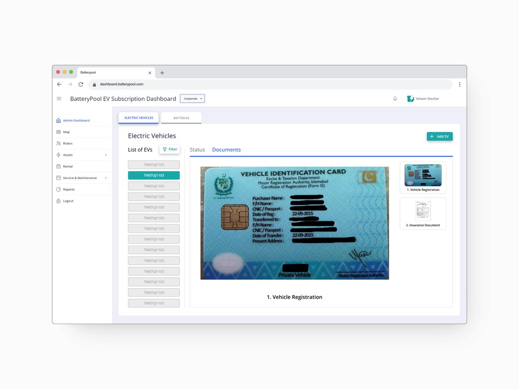
Riders (complete details of the riders i.e license, vehicle registration)
Batteries (add or manage or update the details)
Swapstations
And in this case study we'll just have a glimpse of some modules due to the NDA.
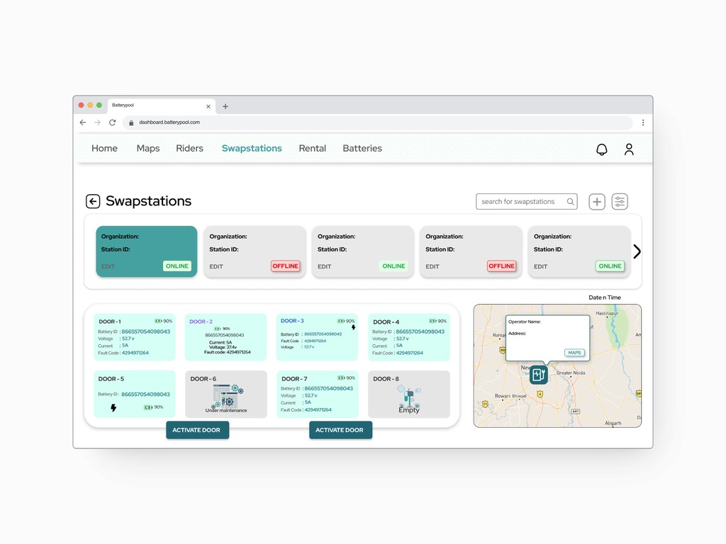
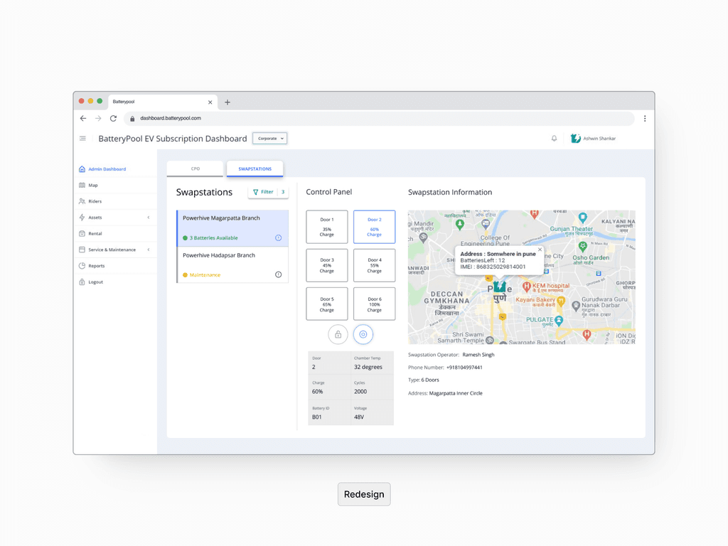
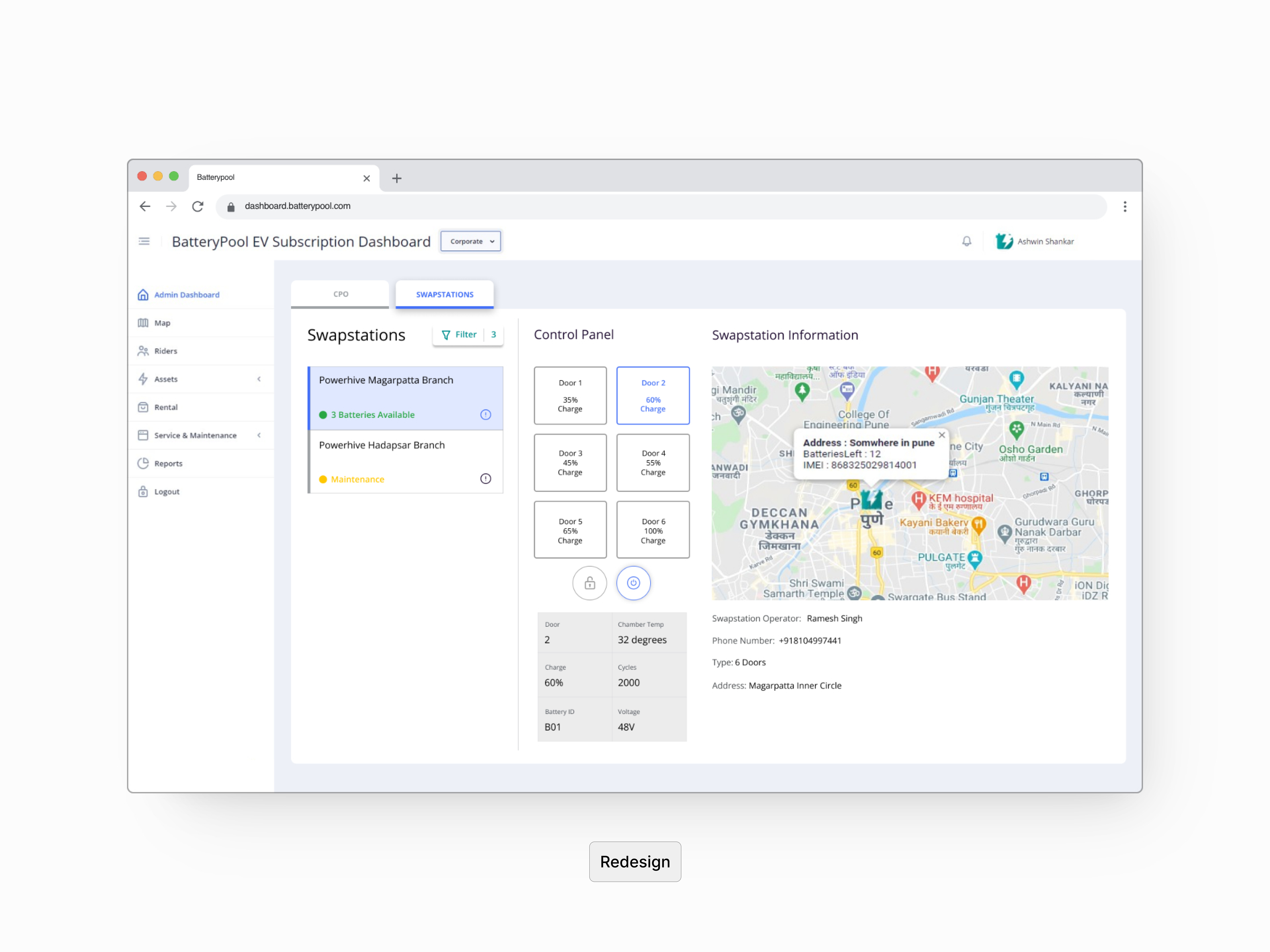
The issues with these designs were:
Cluttered layout with inconsistent spacing and organization of information. The swapstation status (ONLINE/OFFLINE) and battery details were presented in a compact, almost cramped manner, making it difficult to quickly assess the situation.
Important details such as battery status, station information, and map location were all presented with similar visual weight, causing cognitive overload with lack of information hierarchy.
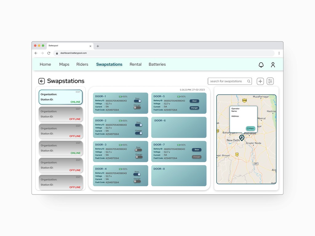
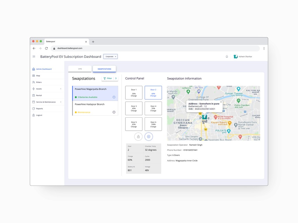
Breaking down the redesign:
More spacious layout with information hierarchy which helps the operator focus on critical tasks with better visibility
Maps show more relevant metadata with better visibility and bigger widget than the previous design
The main module navigation bar looks more clean with the icons
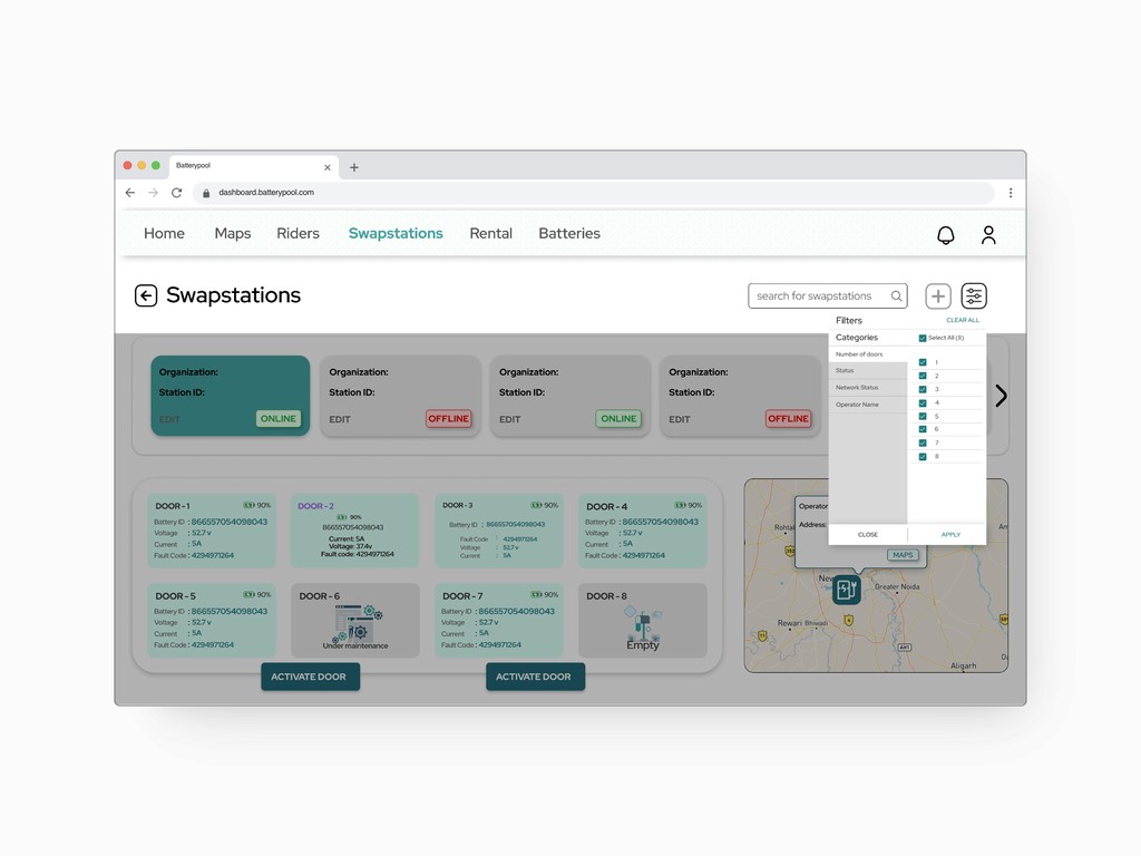
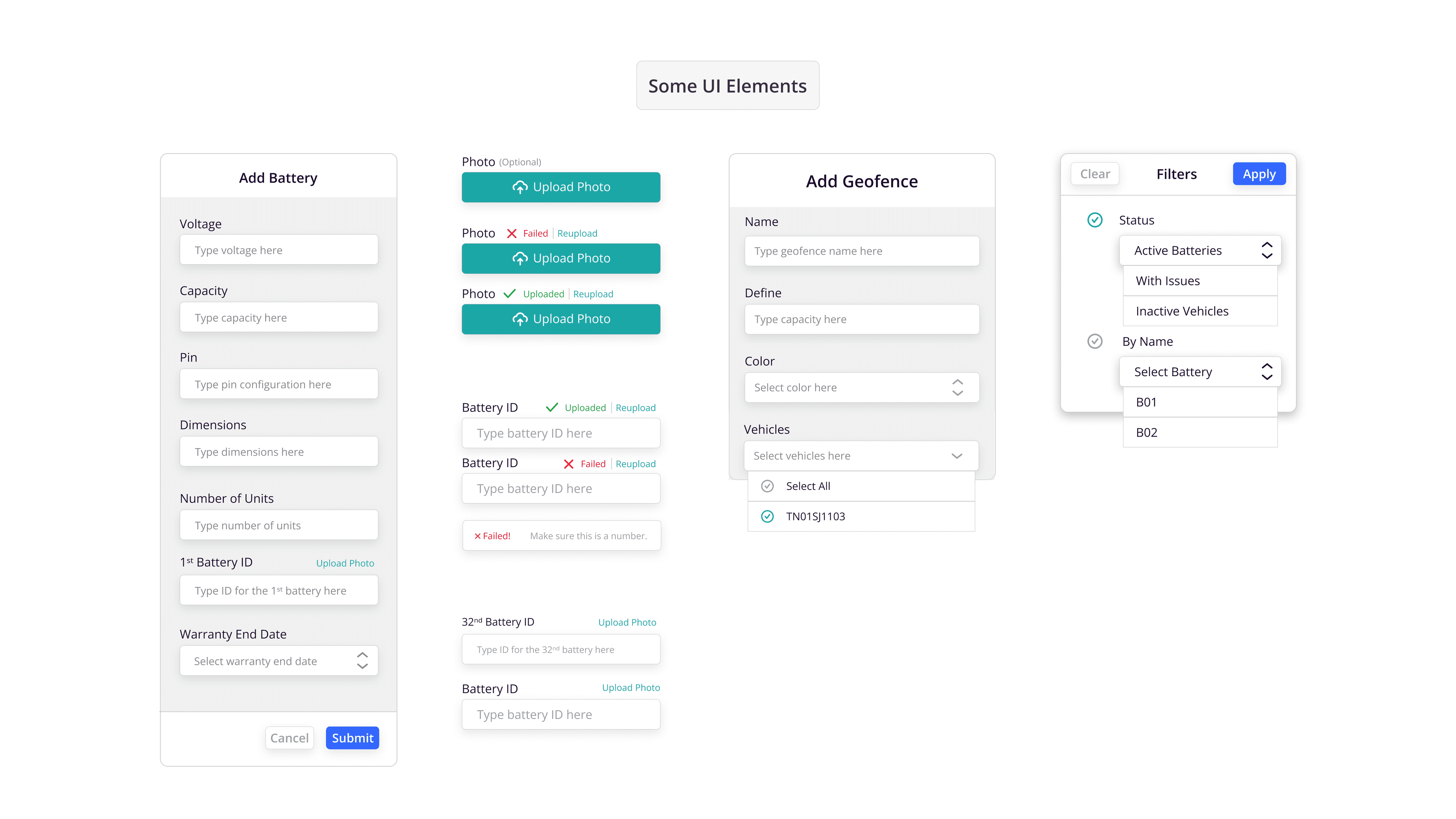
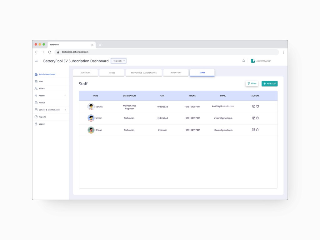
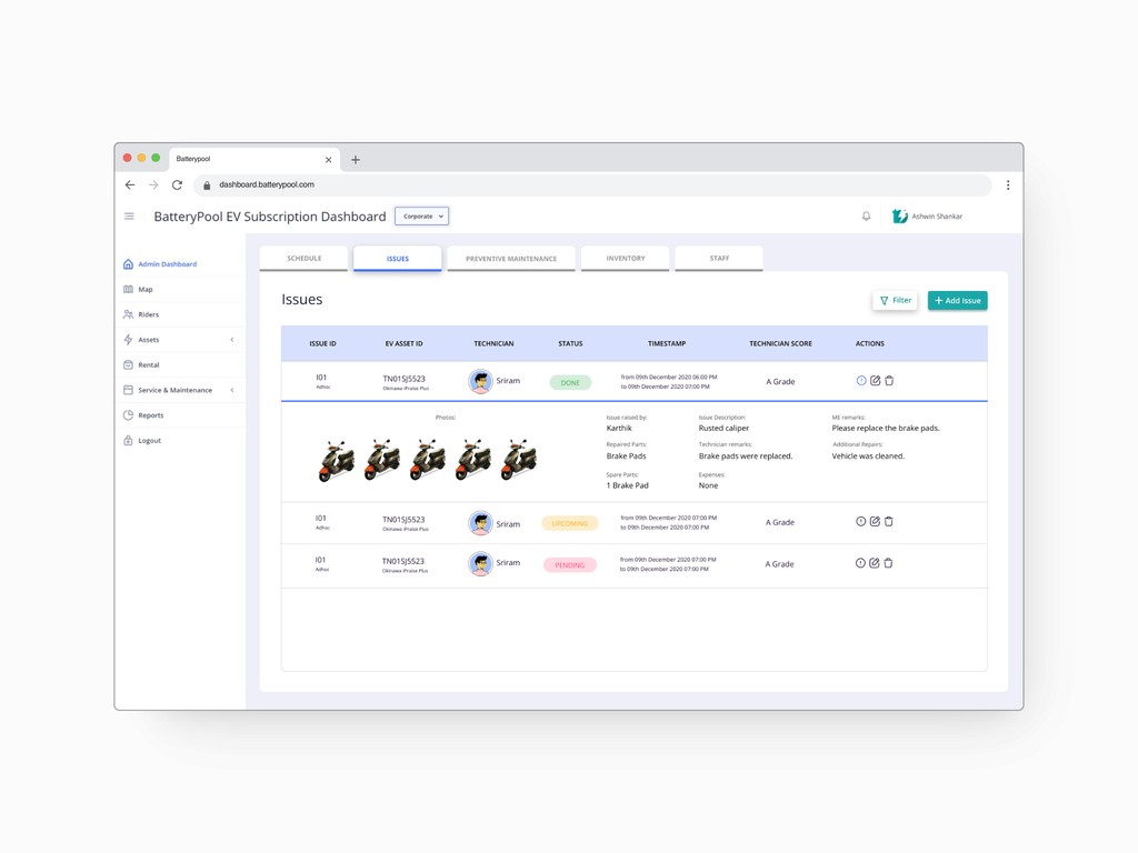
some more visuals
But here are the things which I learned working at Batterypool as a product design intern:
Designing SAAS dashboards is actually hard, not as easy compared to designing for mobile as you have a lot of data visualisation and information dense content.
Most of the internal tools doesn't have a lot of impact because of the userbase being too less.
Working remotely isn't for me, less accountability and no exponential learning; working on-site with real people in your early career is the way to go in my opinion.
