Leveraging Visualization to Make Financial Portfolios More Accessible and Actionable for investors
❋ A LITTLE SNIPPET OF THE FINAL DESIGNS ❋
Groww is an investment platform which allows it's users to explore stocks, mutual funds, digital gold, and place orders online, track transactions, and invest in IPO's.
I have been a Groww user since past 3 years and there is no portfolio section/tab in the app which shows the data of all your assets at one place.
So being a product designer, I took the challenge to solve the problem within 7 days.
You as a product designer are supposed to design a section/new tab in the home screen of Groww mobile app, that shows users a preview of their total assets, the profits and losses they have made on their funds. This should be an aggregated view across all the above mentioned asset types. The idea with this section is to quickly give an overview to the user about the overall health of their portfolio.
Further breaking it down:
Introduce a new section/tab on the home screen of the Groww mobile app.
✦ The section should display a preview of users’ total assets.
✦ It should include the profits and losses made on their funds.Provide an aggregated view of various asset types.
✦ Combine data from different asset types to show a comprehensive overview.
✦ Use data visualization concepts to enhance understanding.
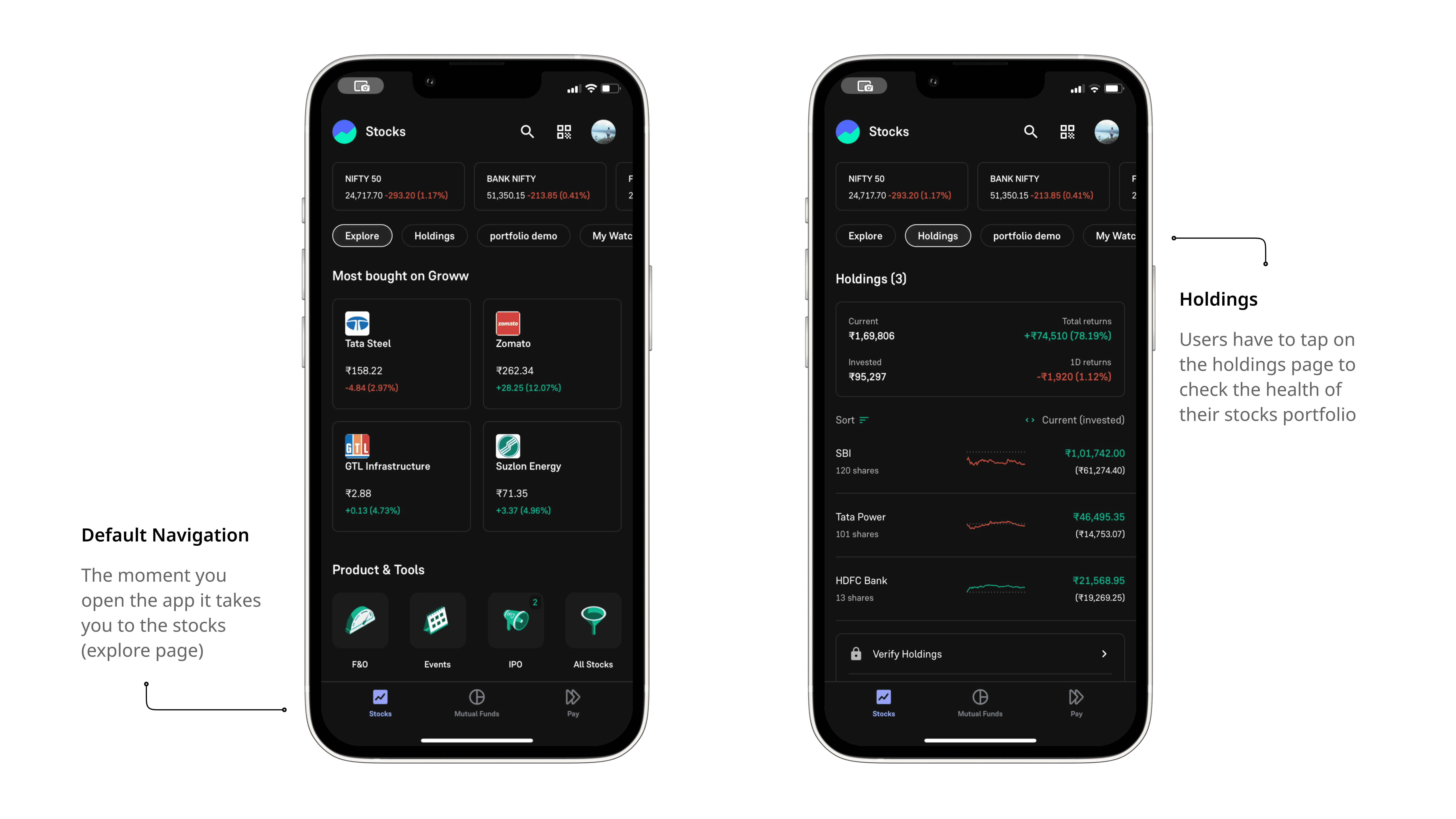
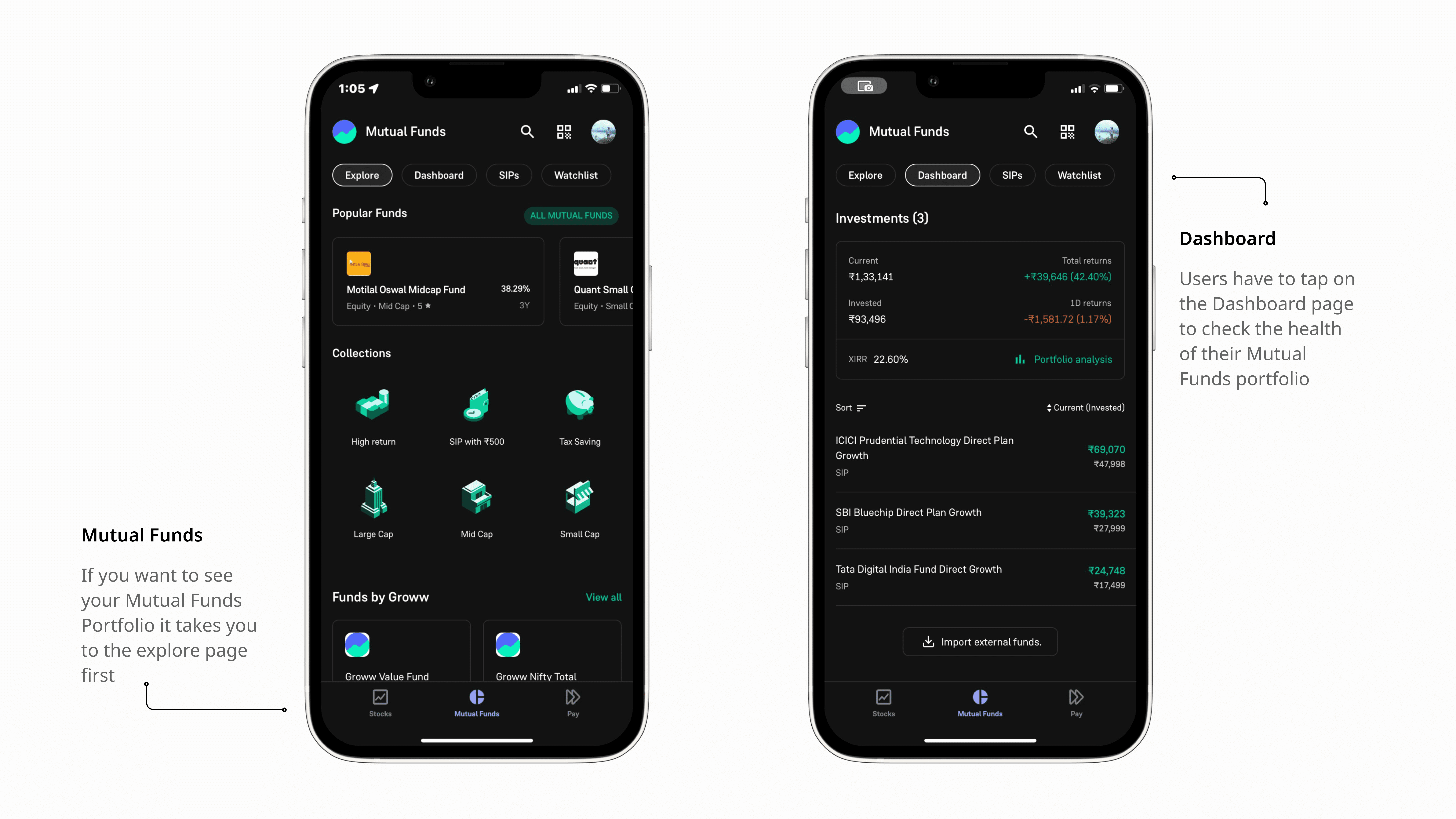
Current Stock Holdings Flow
Current Mutual Funds Dashboard Flow
There is no way in the current flow where you can see the health of your total assets (i'm considering only Stocks and Mutual funds for this assignment due to time constraints).
If you want to have an idea if you're in profit or loss you will need to manually calculate the holdings of stocks and investments of mutual funds

Pain Points of the current flow
Thinking from another perspective, it's not really a problem it's a choice of good user experience. Groww has been operating without the portfolio tab/section since 2017, and it has been doing pretty well 6.6 MAUs currently and it's not like they have a bad user experience.
After doing some competitive analysis, I learned that every other investment/trading app in india has a portfolio tab which shows the overall health of your holdings
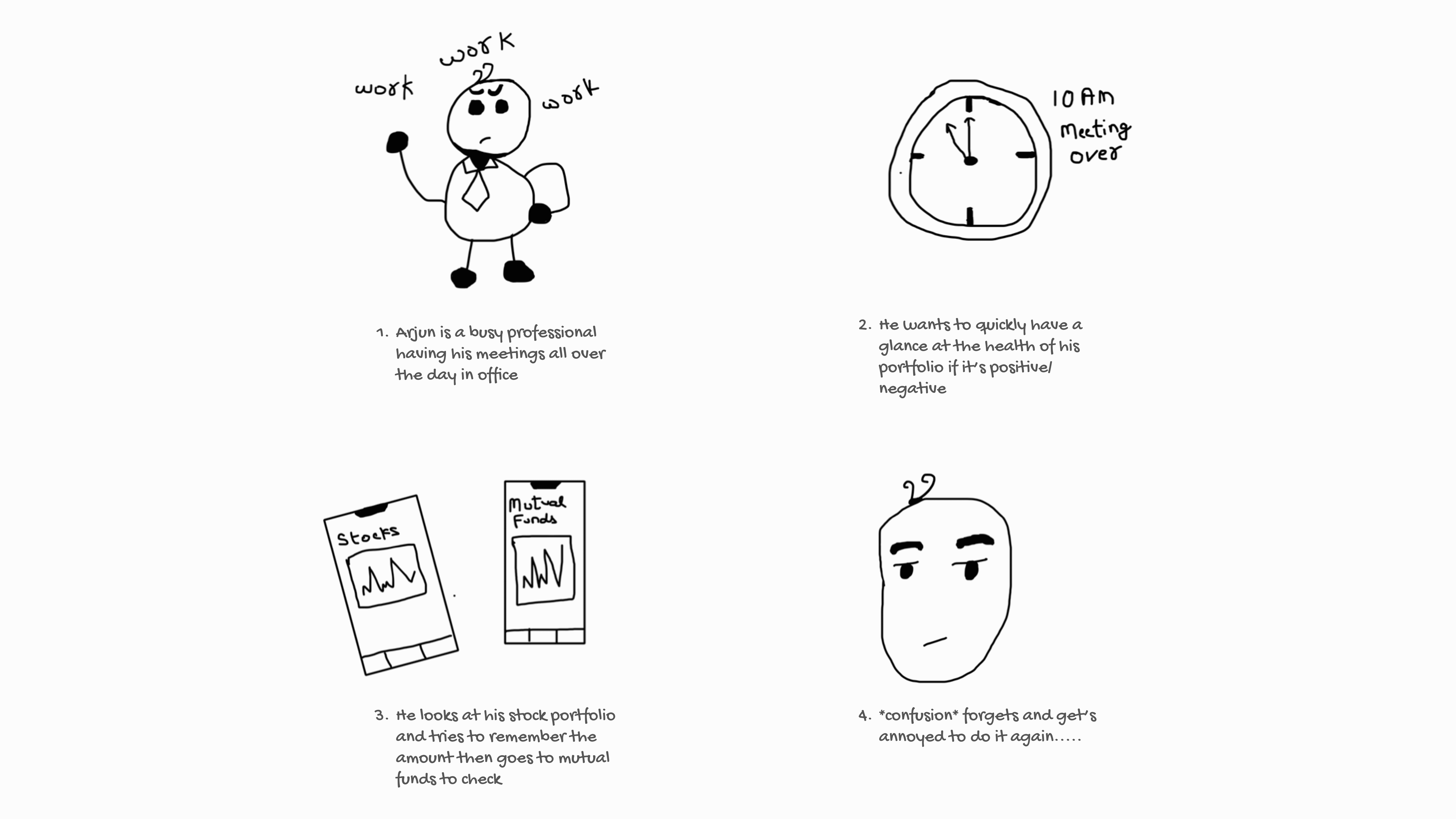
User story of the current flow
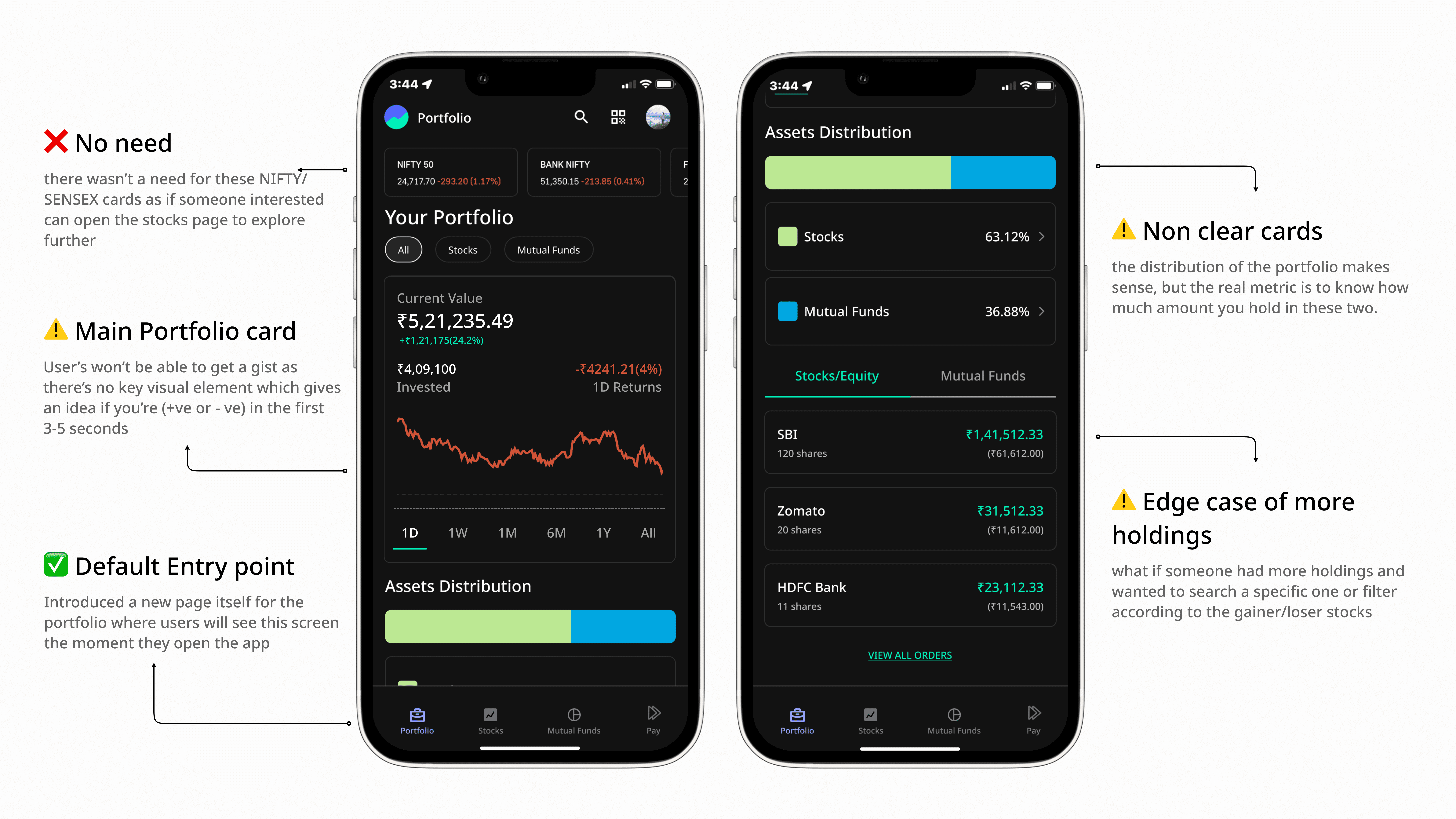
First Iteration of the Portfolio Page
here's a prototype of this first iteration of the flow; which I had recorded to show it to someone to get an initial feedback on it.
you can watch it here
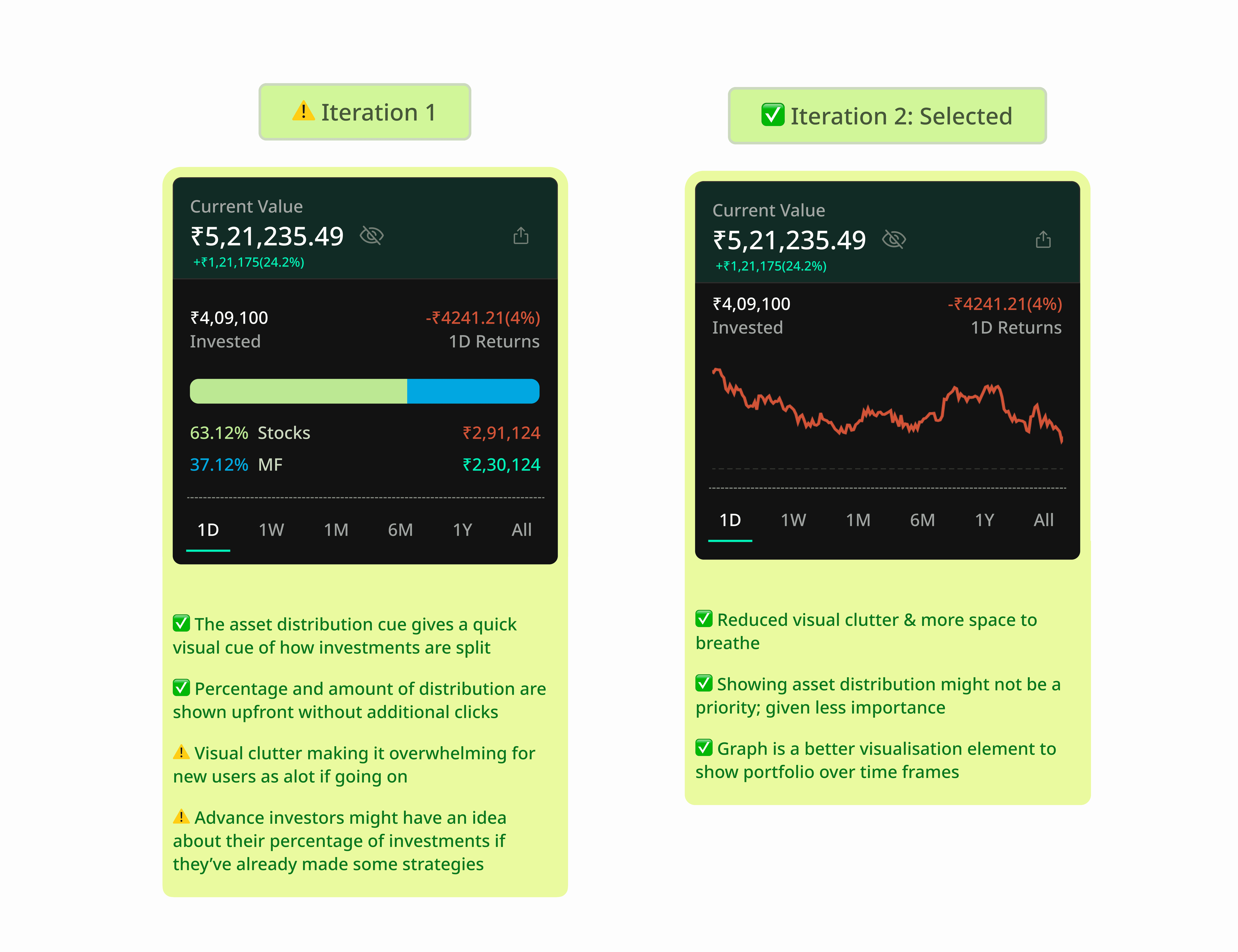
Portfolio Card details & iterations
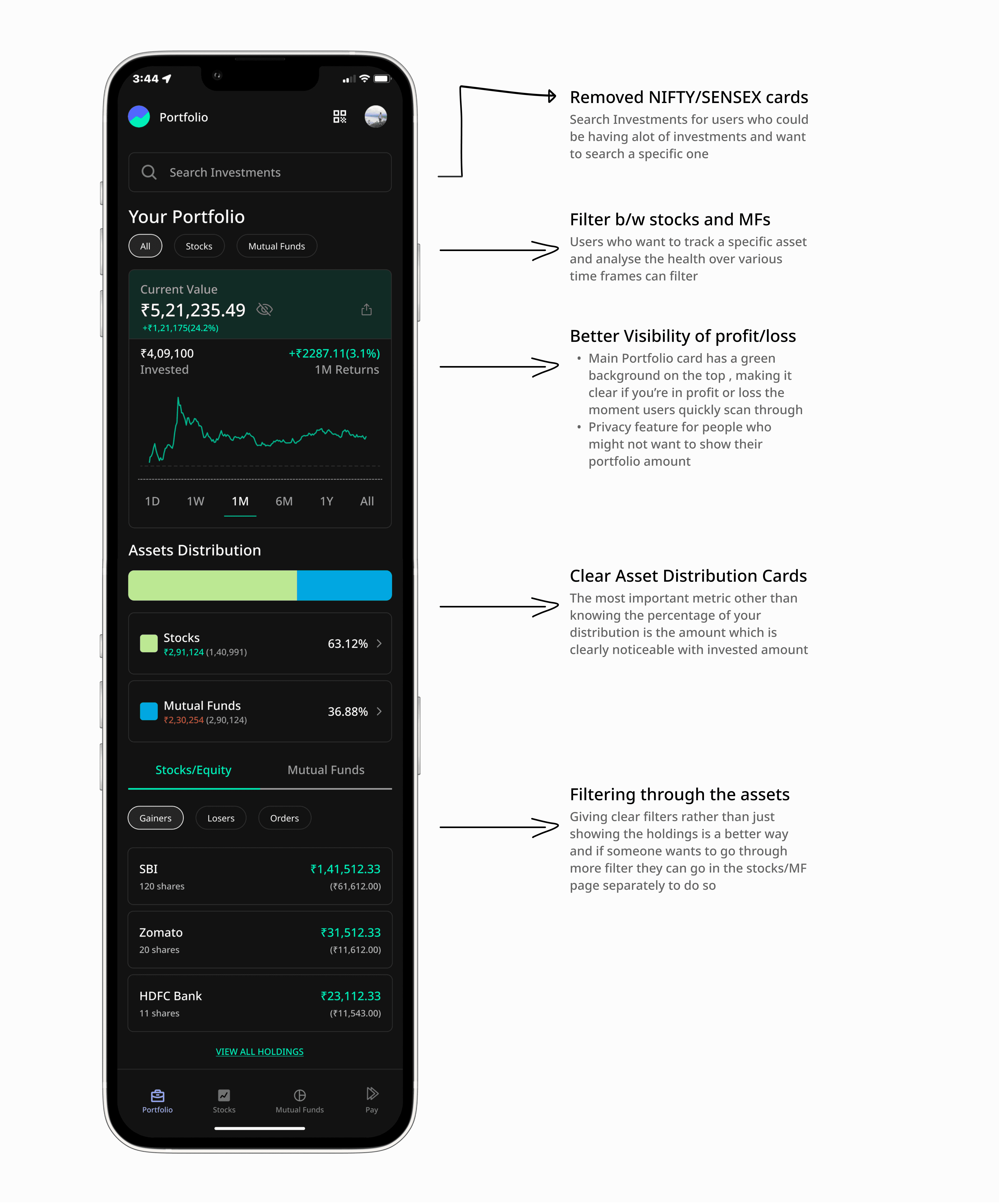
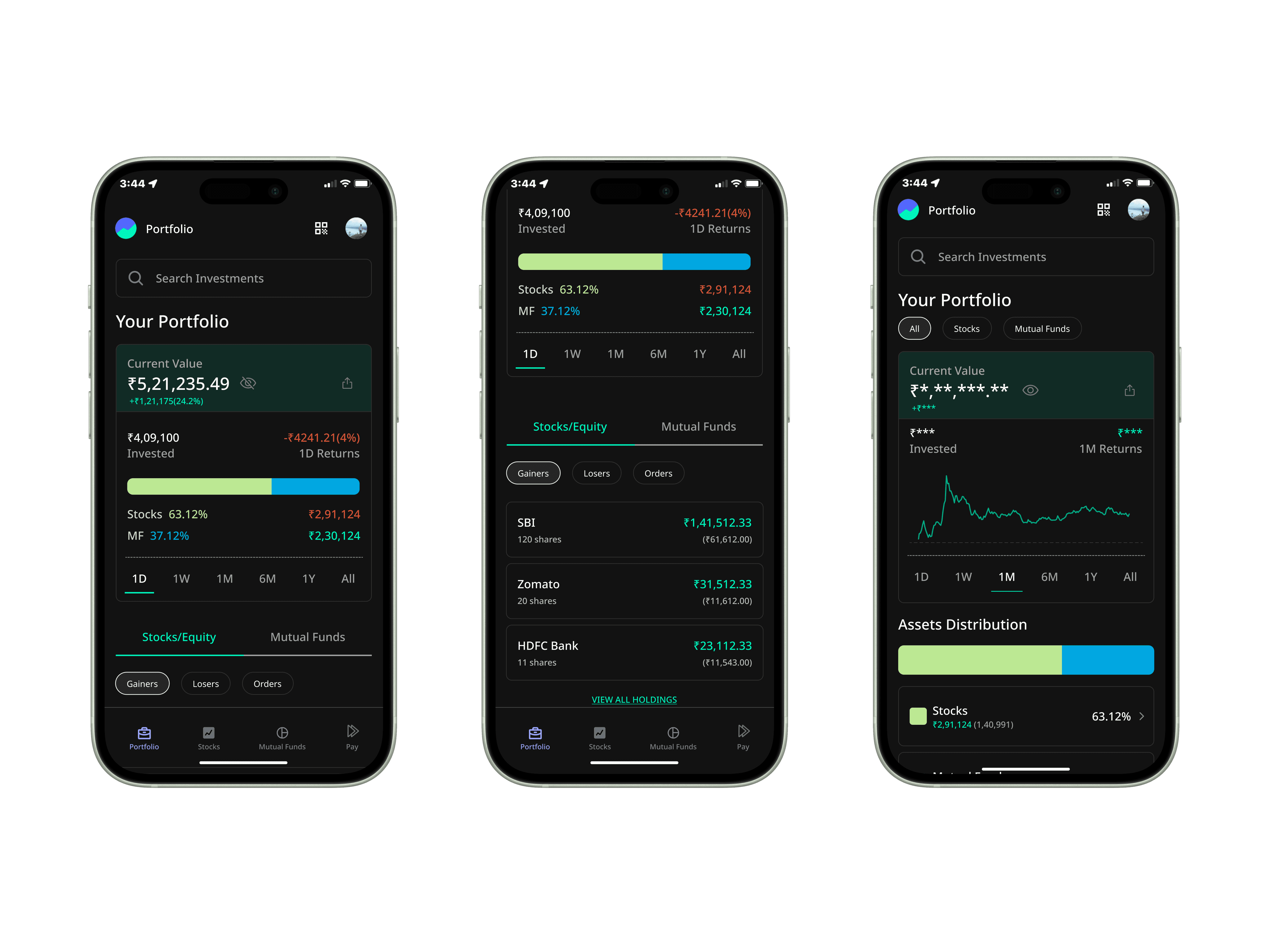
❋FINAL VIEW OF THE PORTFOLIO PAGE❋
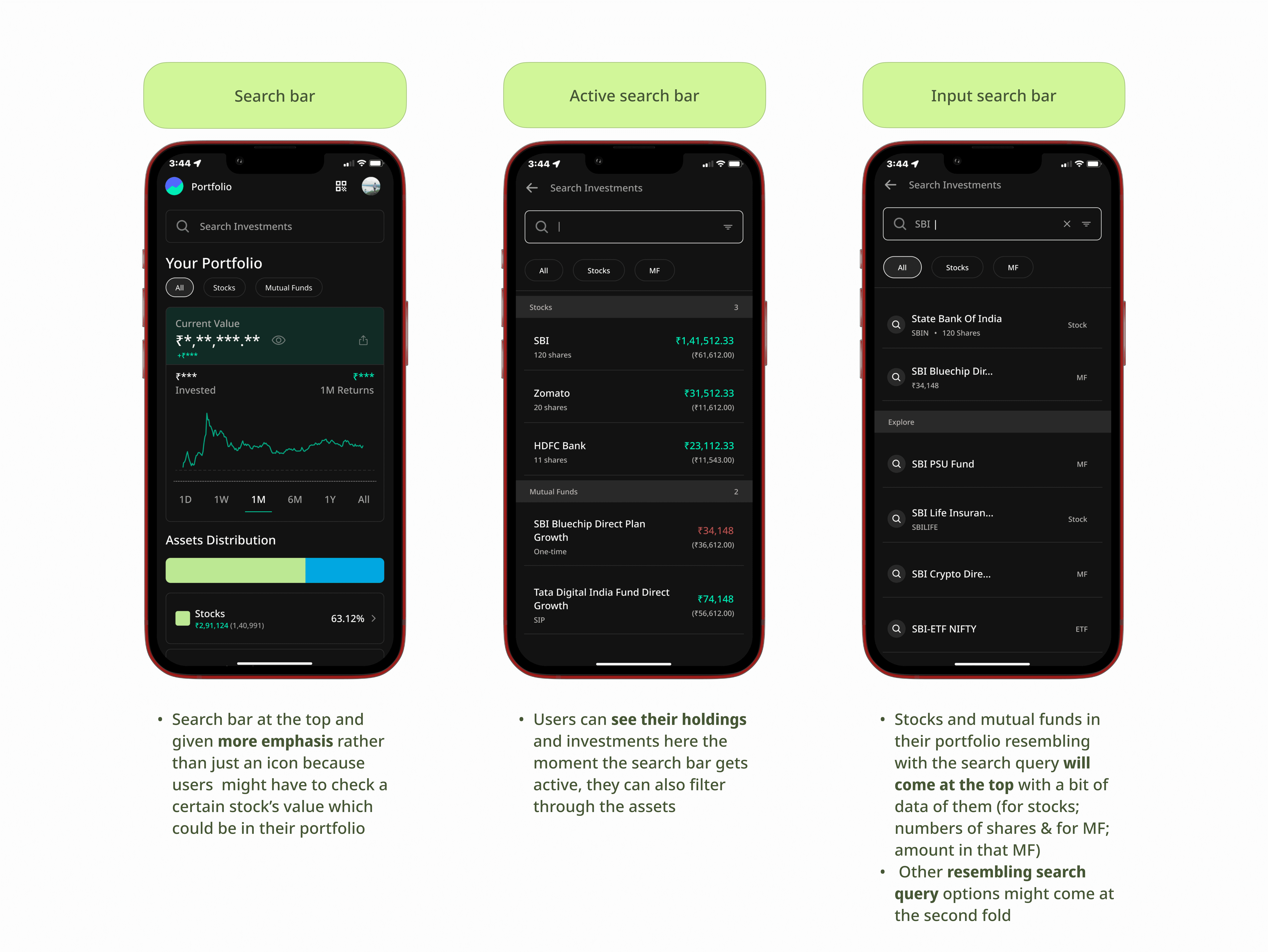
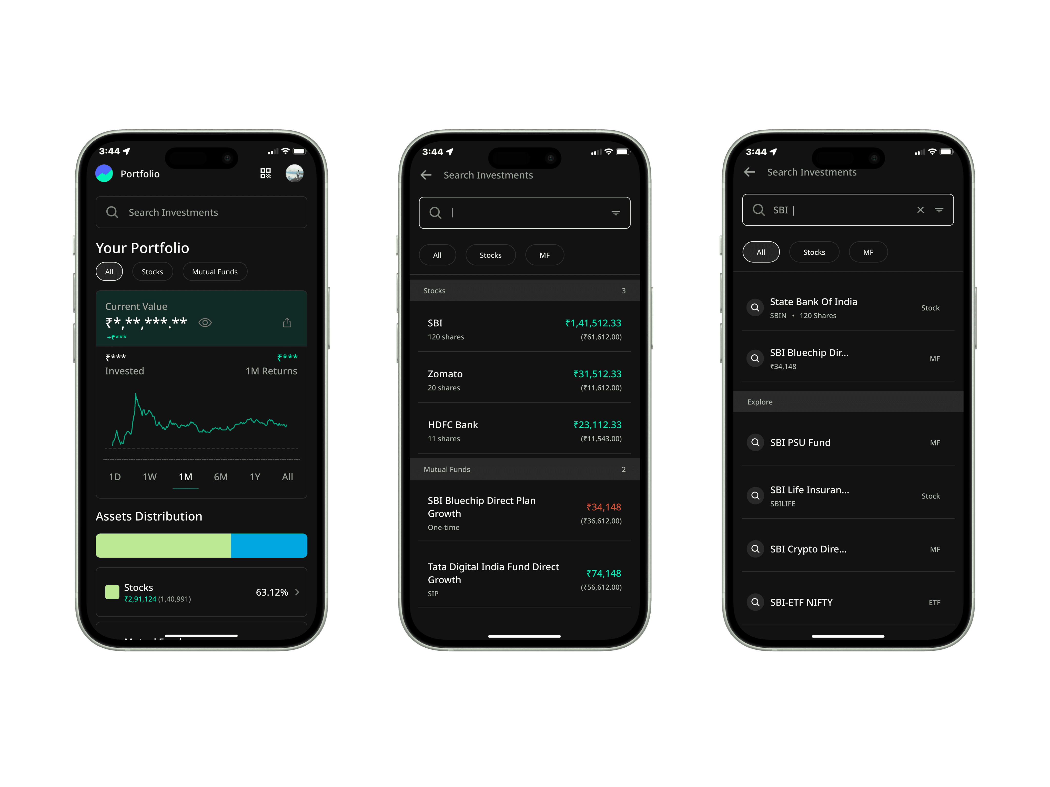
🔍 SEARCH BAR DESIGN 🔎
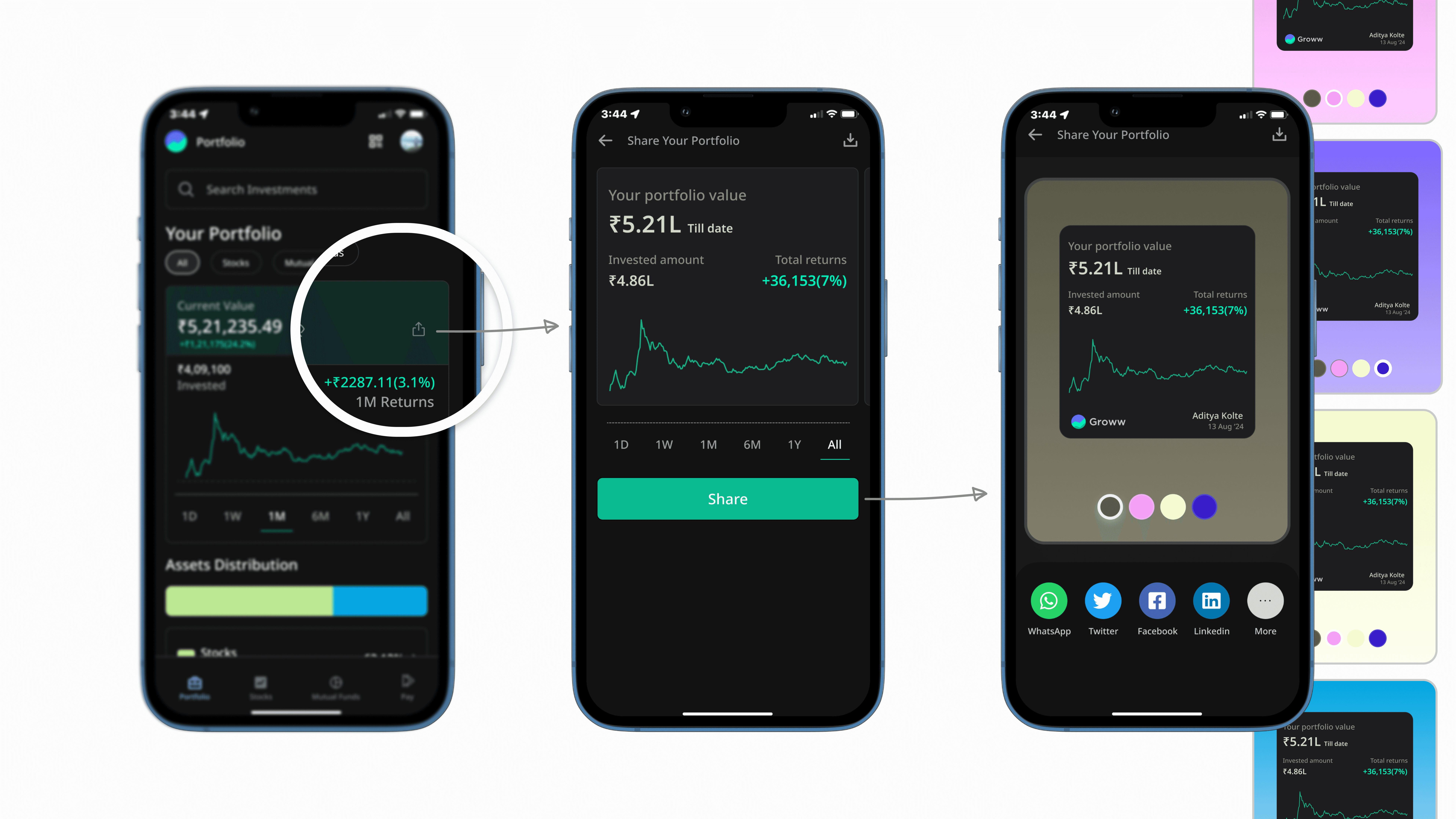
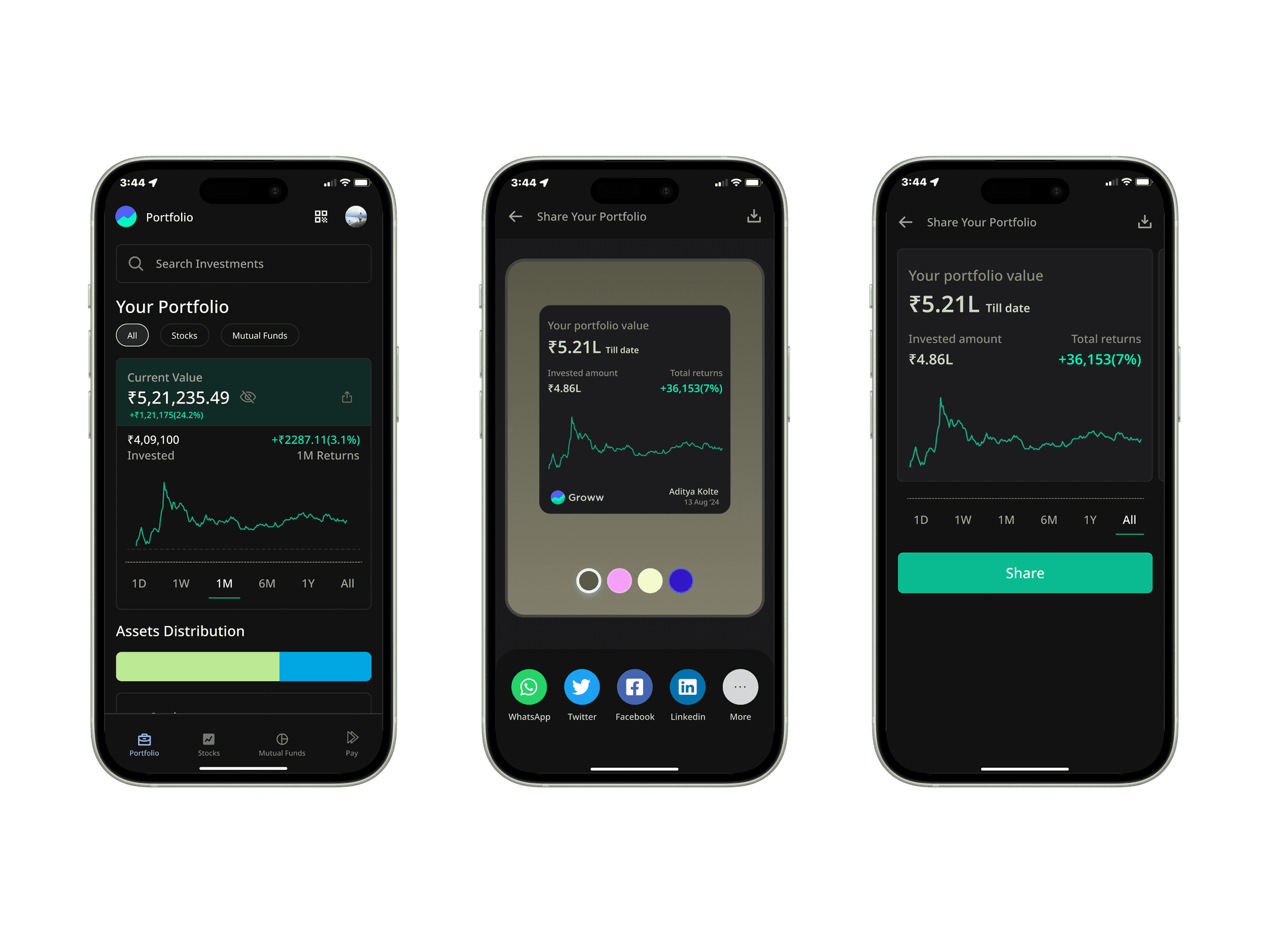
❋SHARE YOUR PORTFOLIO FEATURE ❋
because i've always had my family members asking me about my portfolio 😛
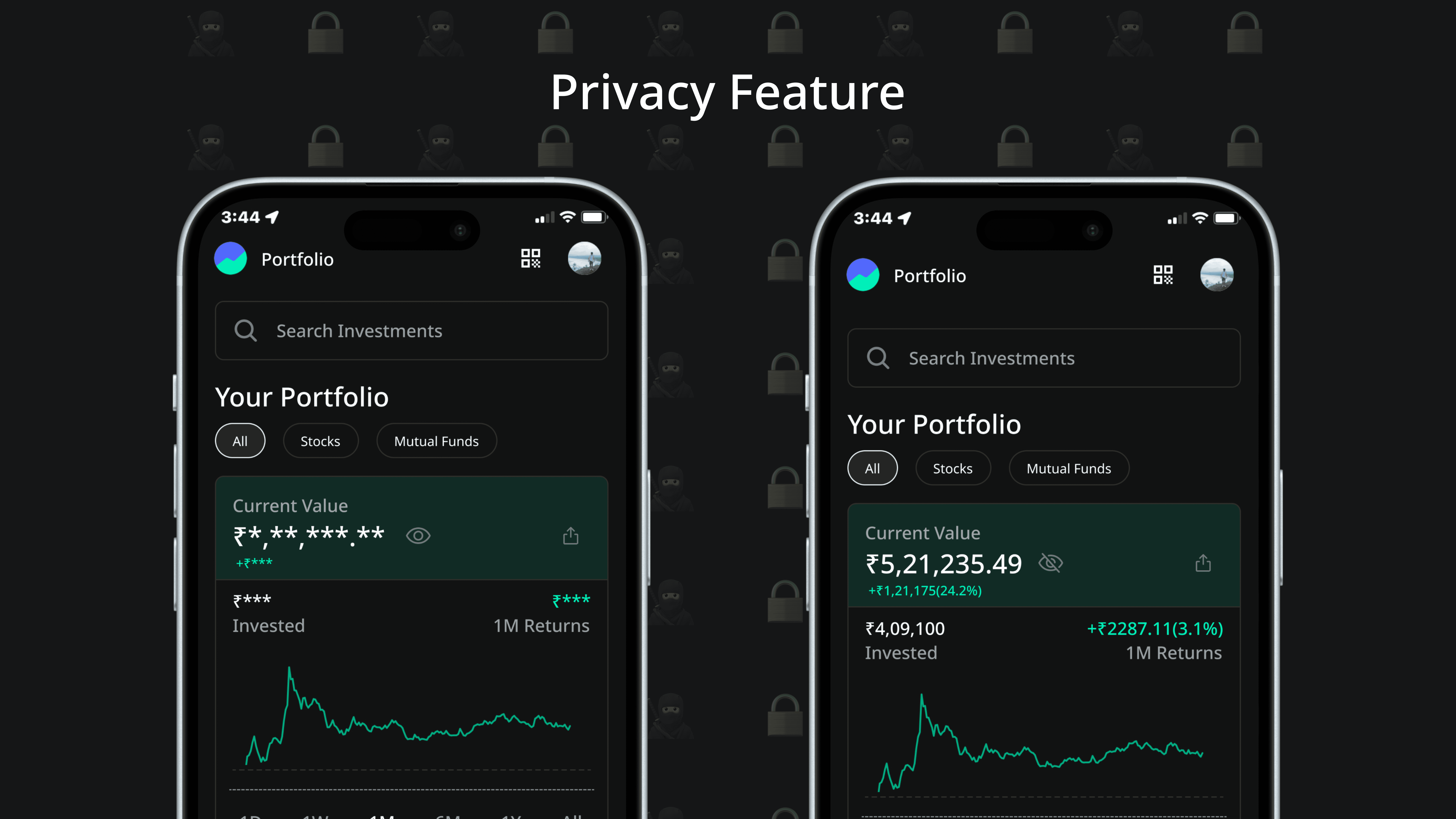
🥷🏻 Privacy view for people who might be travelling or don't want to see the value of their portfolio 🔒
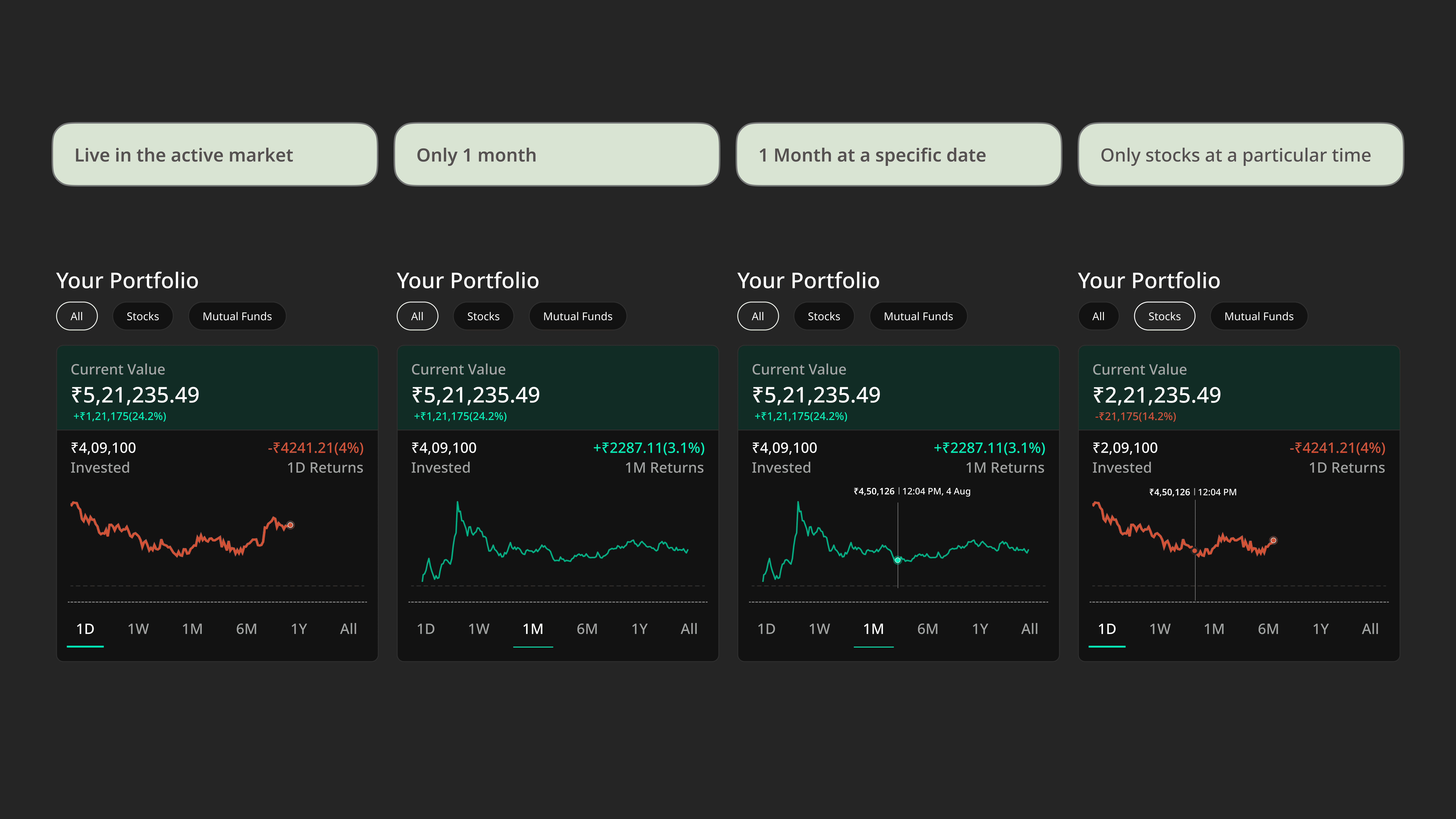
Different variations of the portfolio card
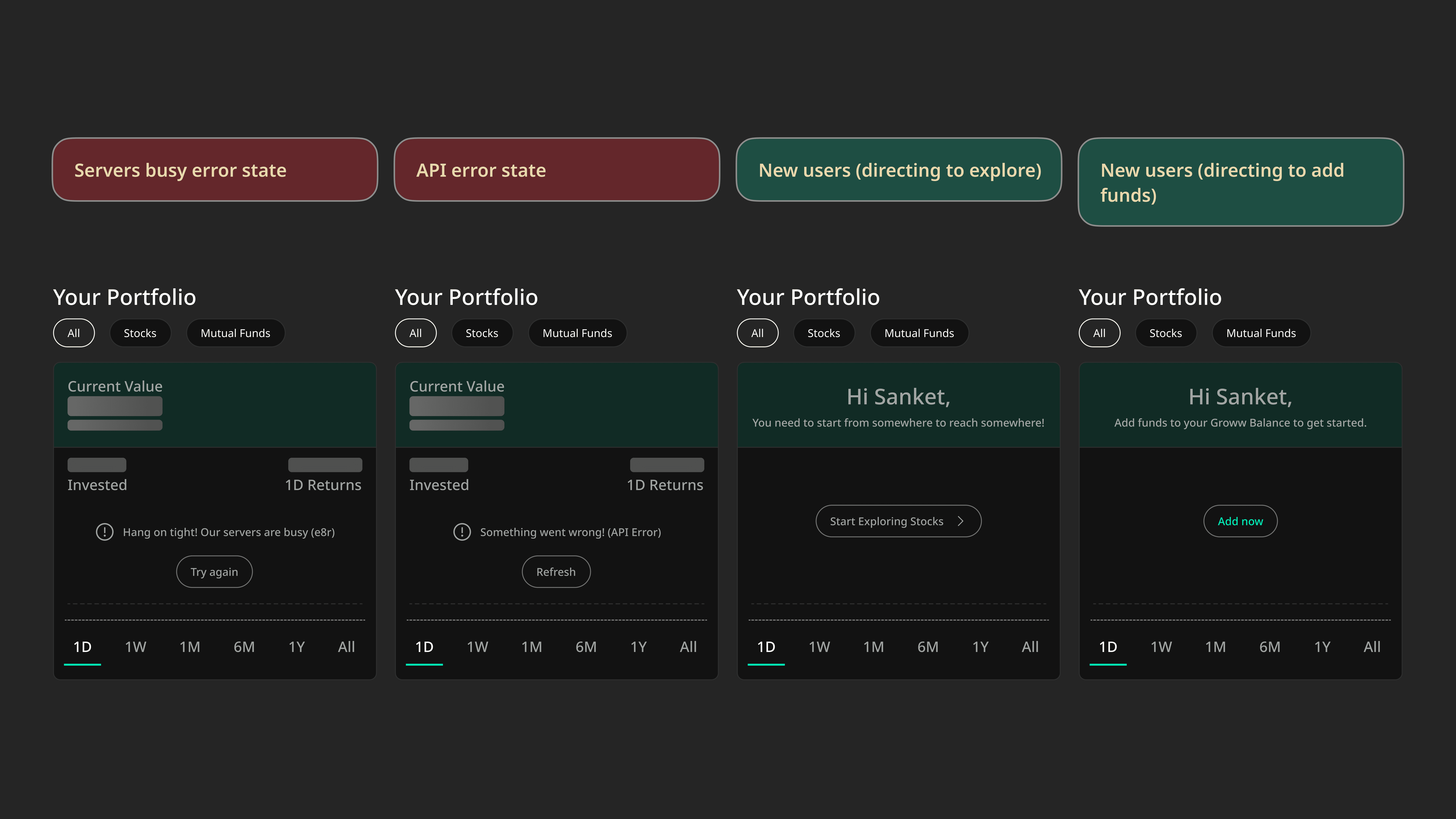
Error states and edge cases for new users
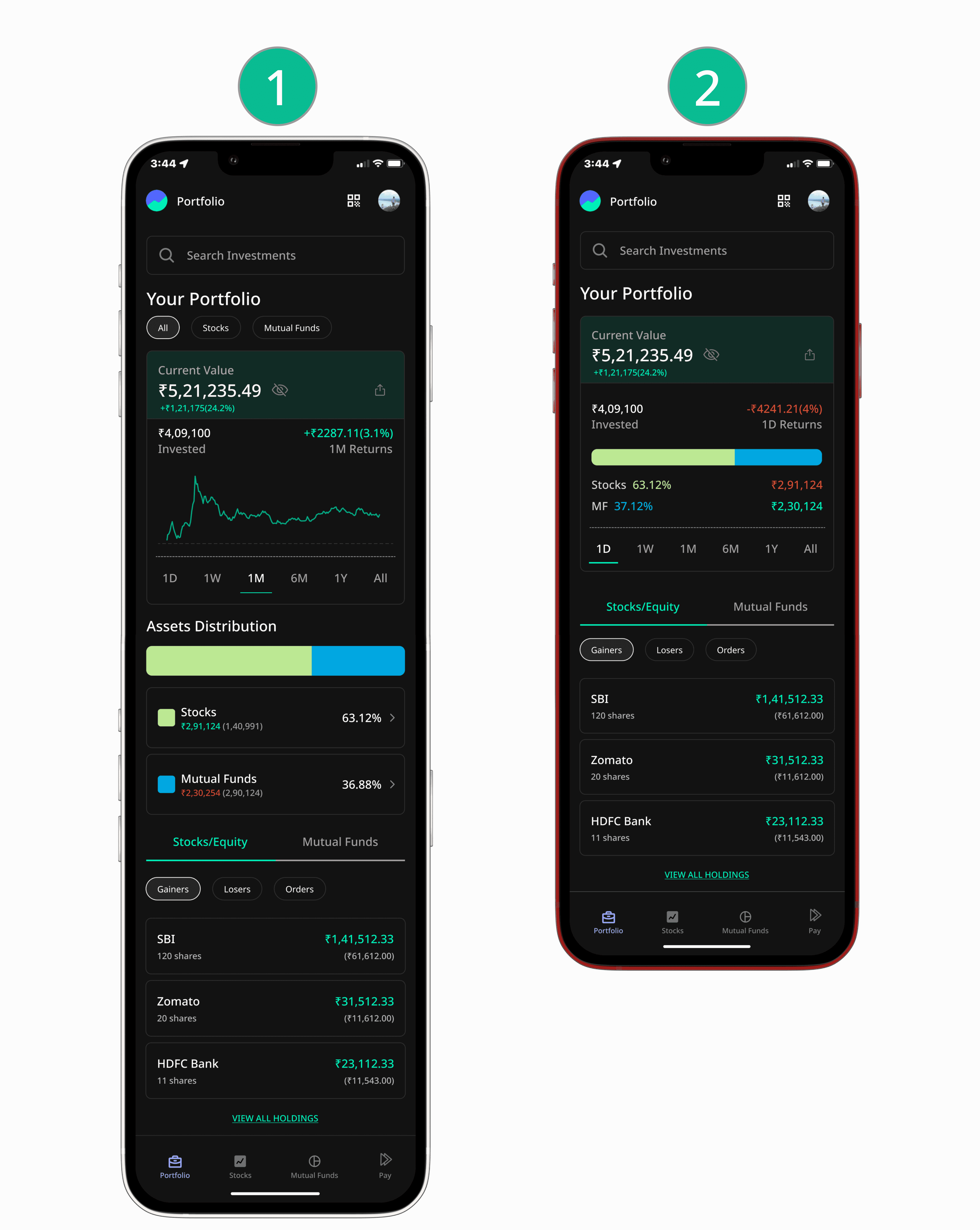
A/B testings for these two flows
Now if i had to choose between these two flows of the portfolio page, i would consider doing an A/B testing on these two by randomly assigning it to two different segment of users (new investors vs advanced investors who've been using groww since a long time and have a higher portfolio value)
Because I think both of these flows have their own pros and cons.
Objectives of the testing will be to:
determine which design leads to better engagement and user preferences.
This is what my hypotheses says:
Design 1: Users will engage more with detailed information and visual representations, leading to a deeper understanding of their portfolio status.
Design 2: A simpler, more concise layout will enable quicker comprehension and facilitate easier navigation.
Metrics to choose a better design would be:
Engagement: Track the number of interactions (clicks, swipes, and taps) users make on each page.
Retention: How frequently the users of both these designs are revisiting the portfolio tab; return rate ∝ better design.
CTRs: Are the CTRs from the portfolio page more or from the individual asset page more.
Worked on this case study with a lot of constraints I think; should've explored more.
Thinking about the core business impact while designing is what's important.
Integrating small sub-features like (share portfolio & privacy) would build a connect with the users which is very important while shipping designs.
Wanna talk about the features you wish existed or the impact of accessibility in design? say hi here
